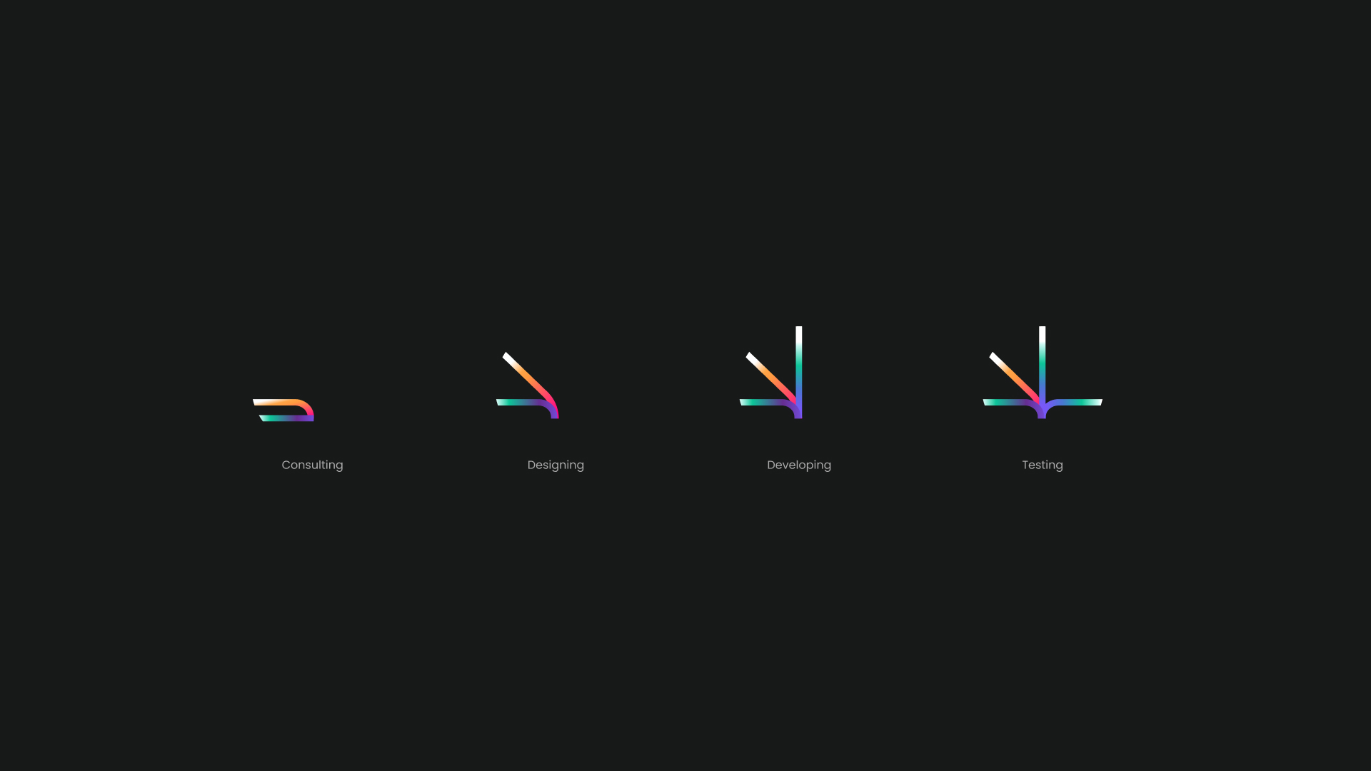
UX/UI Design
Project Management
Web Application Development
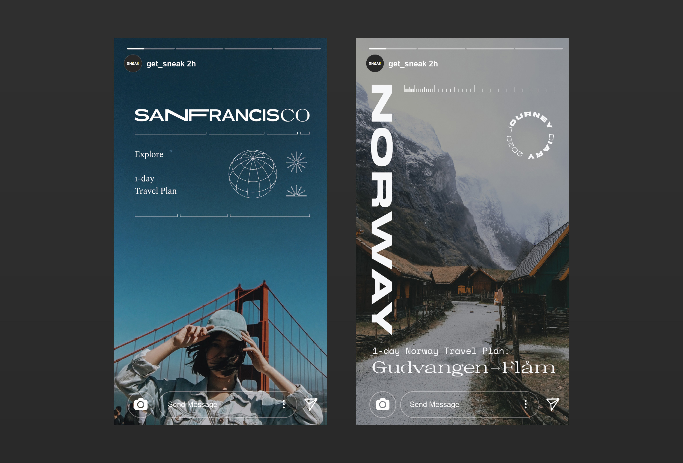
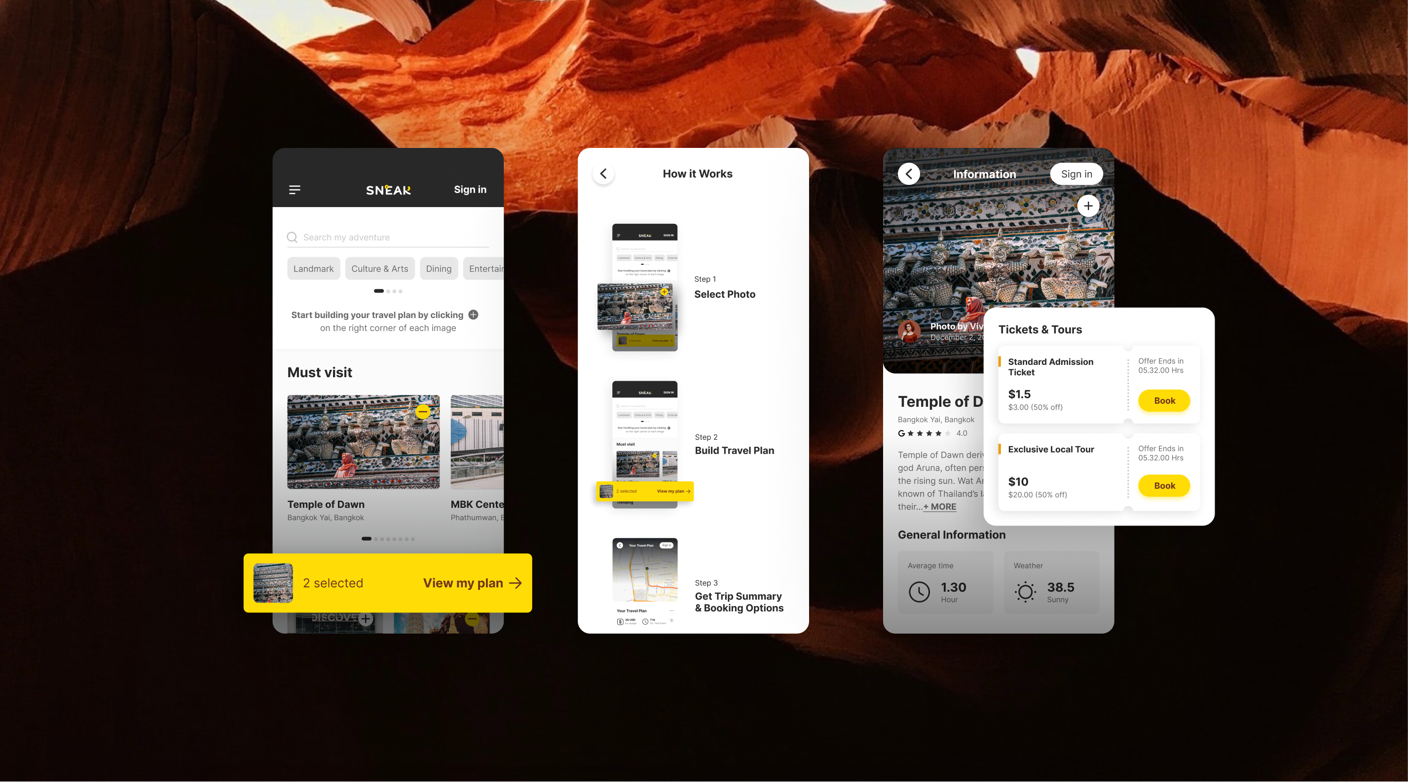
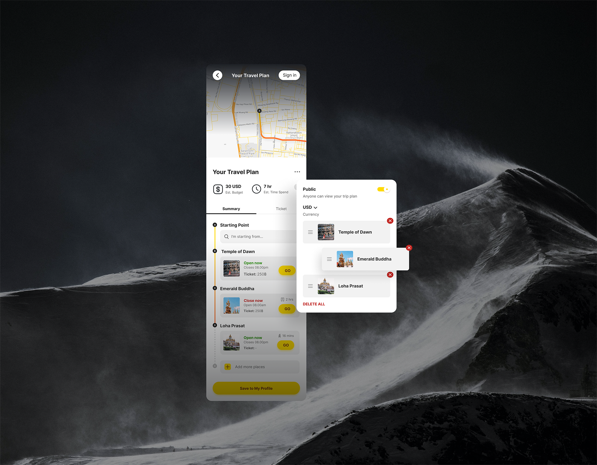
In this challenge, we aim to create a friendlier and more effortless trip-planning brand and user experience. Our solution revolves around a user-friendly platform that streamlines the entire process, making it delightfully simple. Users can easily pick their desired travel destinations, and our intelligent system will take care of the rest by generating travel itineraries automatically. No more manual pinning of locations one by one – it's a fun and seamless way to plan the perfect adventure!

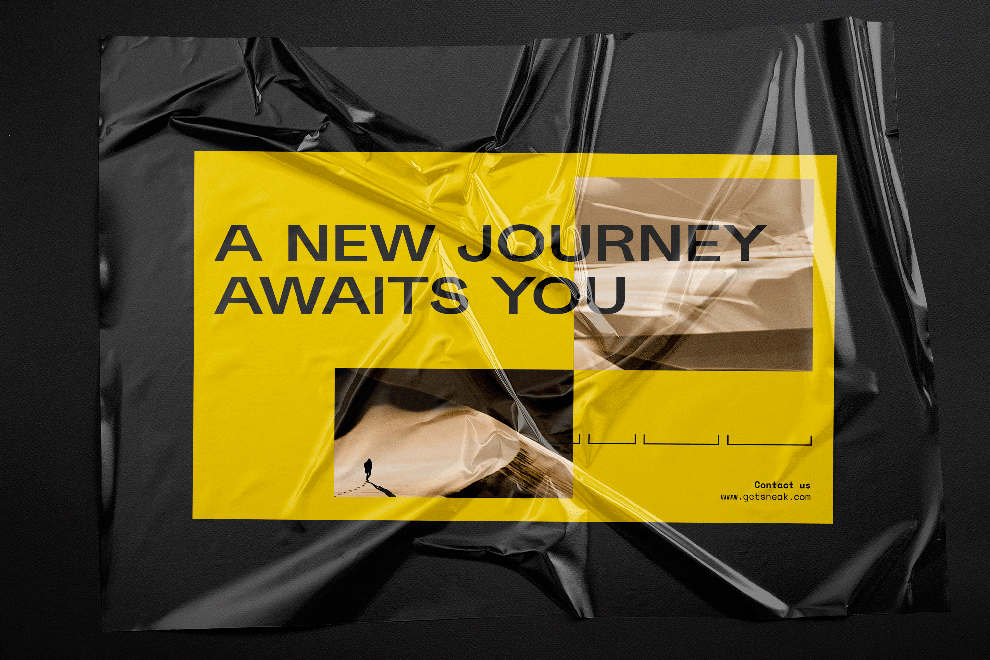
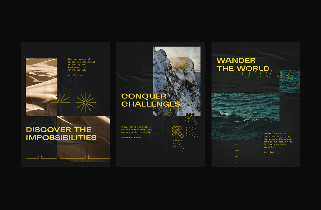
SNEAK's logo embodies the essence of modern travel, which is the core value of the brand. It creatively integrates the symbols of the geographic coordinate system (Latitude, Longitude) with a bold and contemporary typeface. The brand's primary color palette of yellow, dark grey, and white complements their adventurous and social media-oriented preferences. Graphic elements like wind direction and sun further strengthen SNEAK's identity across marketing materials and digital platforms.
.jpg)


SNEAK's logo embodies the essence of modern travel, which is the core value of the brand. It creatively integrates the symbols of the geographic coordinate system (Latitude, Longitude) with a bold and contemporary typeface. The brand's primary color palette of yellow, dark grey, and white complements their adventurous and social media-oriented preferences. Graphic elements like wind direction and sun further strengthen SNEAK's identity across marketing materials and digital platforms.
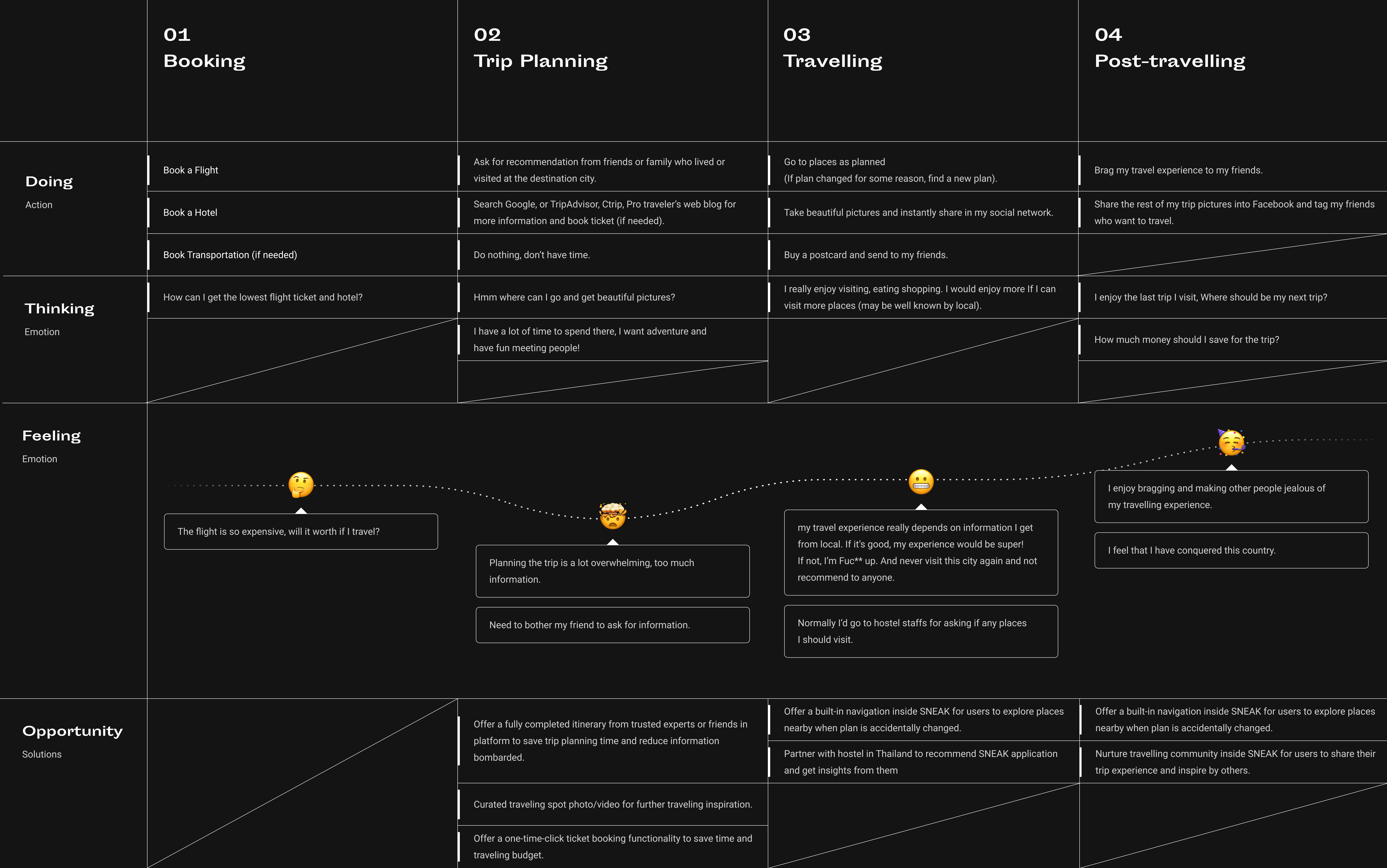
UX Research is conducted to pinpoint personas and user journey map with 10 US travelers (Gen Z and Millennials).
After completed research and Usability Testing, the design is implemented
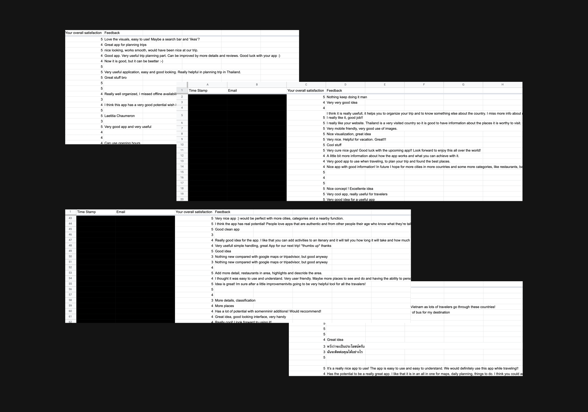
After the first launch of our MVP1, we approach the users at hostels and airport, and ask them to play with our app. Overall, SNEAK gets 4.8 rating on a Likert Scale of 5. Users feel satisfied with how the app works and look forward to using it sometime in the future.