Creative Designer
.png)
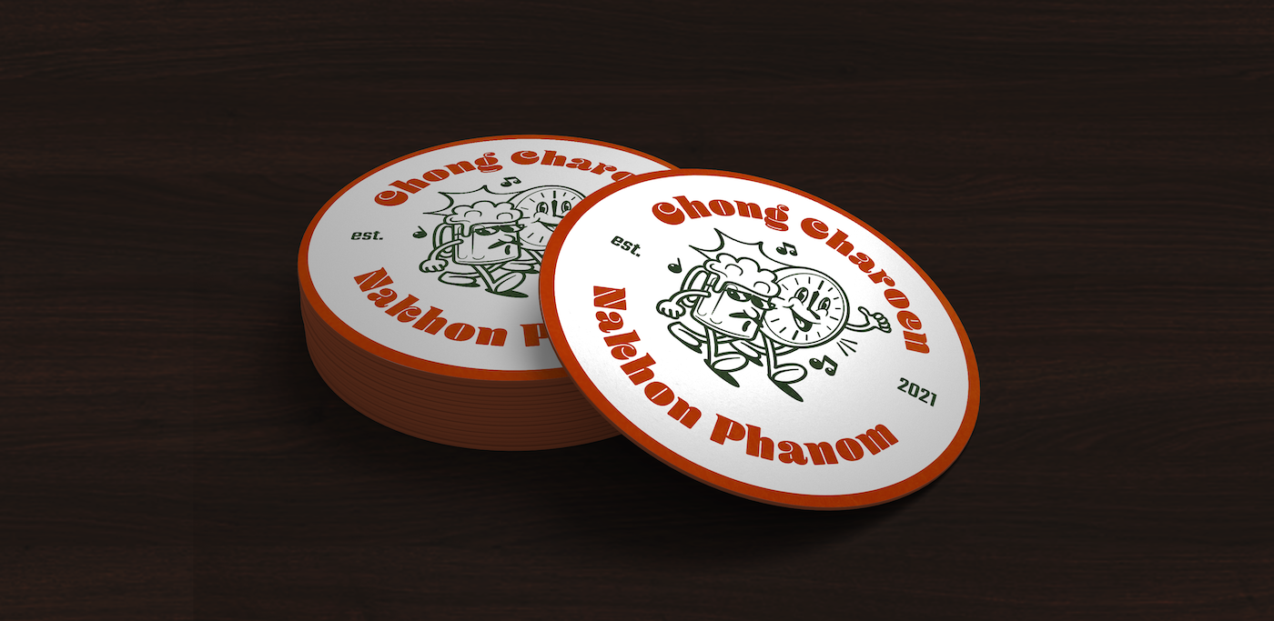
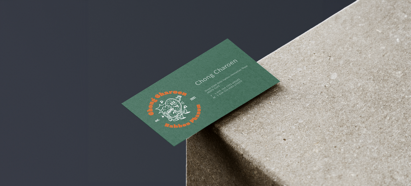
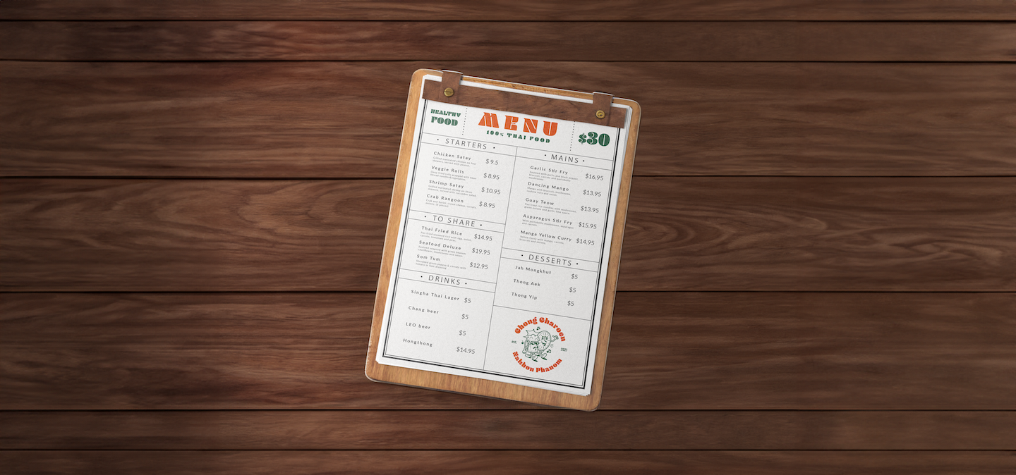
The logo's design is rooted in the owner's connection to Nakhon Phanom. The town's unique cultural and geographical elements have influenced the logo's visual representation. Nakhon Phanom, known for its distinctive characteristics, has been creatively merged with the concept of time and relaxation. Additionally, the logo incorporates a beer mug, representing the concept of enjoying a refreshing drink. This element symbolizes relaxation, socialization, and the gathering of friends and loved ones. The beer mug not only signifies the establishment's offerings but also highlights the owner's connection to Nakhon Phanom, where people often come together to enjoy leisurely moments.

.jpg)

.png)
.png)
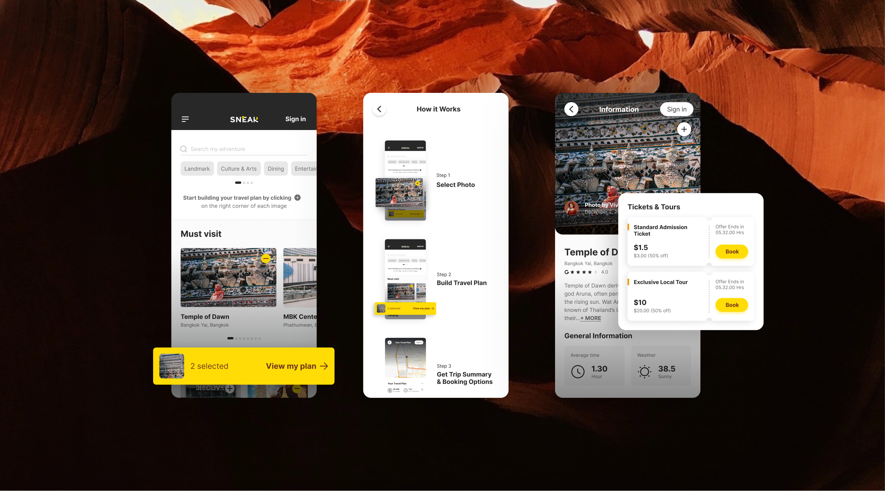
UX Research is conducted to pinpoint personas and user journey map with 10 US travelers (Gen Z and Millennials).
.png)
After completed research and Usability Testing, the design is implemented
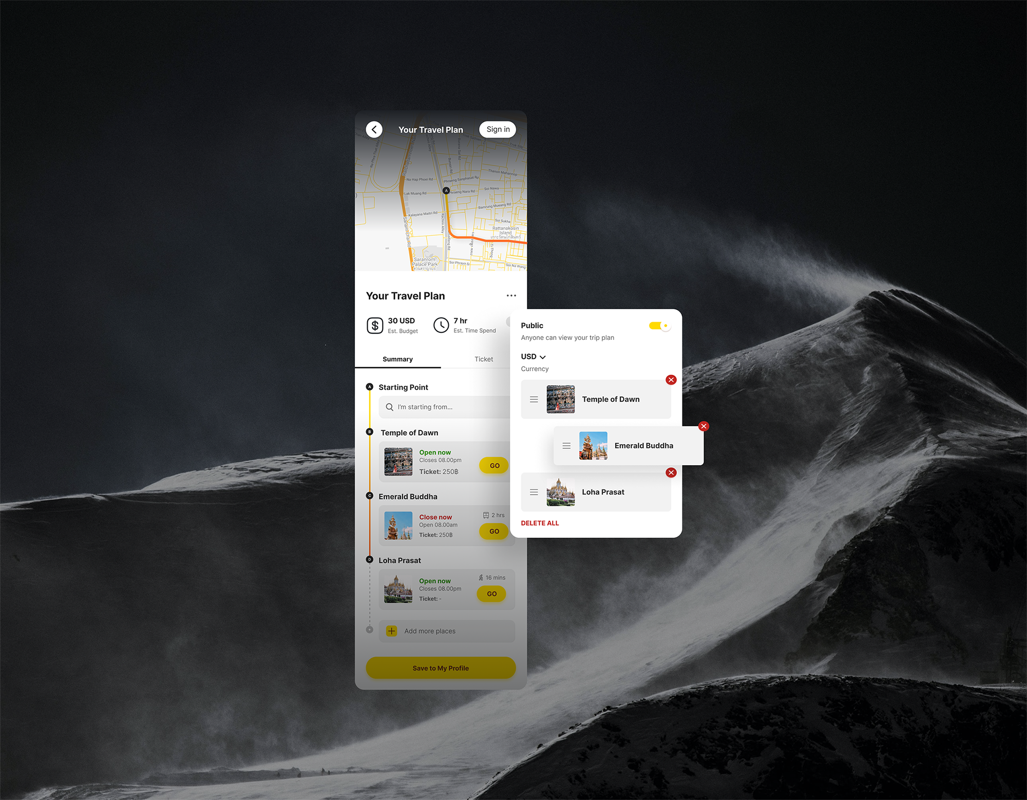
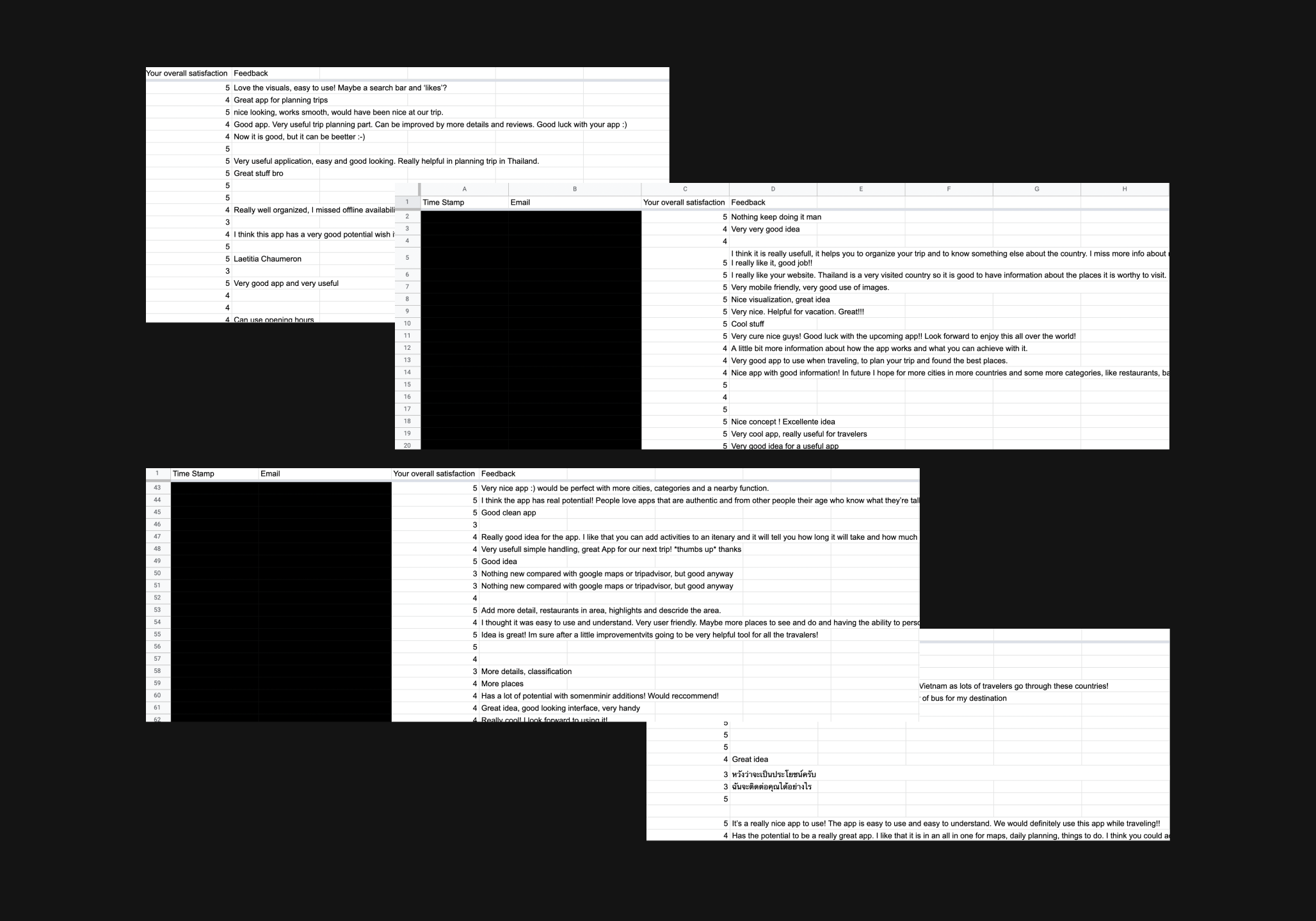
After the first launch of our MVP1, we approach the users at hostels and airport, and ask them to play with our app. Overall, SNEAK gets 4.8 rating on a Likert Scale of 5. Users feel satisfied with how the app works and look forward to using it sometime in the future.